


The advantage of using Matisse Acrylic paint to print with instead of commercial screen printing inks, is that it dries a lot slower, and washes out a lot more easily. Matisse paints have a high pigment load and are cost effective.
Trent asked me to make a couple of stencils by sticking adhesive vinyl on to thin sheets of plastic which he had cut to the same size as the screens. To transfer those stencils onto the screens, Trent coated the screen with a light sensitive emulsion, then laid the film on top and squashed it down with glass or perspex, so no light got in under the stencil. Light is blocked by the stencil, and what is not blocked is hardened in a chemical reaction with the light, and is able to be washed away, leaving only the design you want to print.
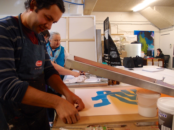
To print on paper your screen needs to have a fine mesh – at least 77T – don’t use the 43T which is the standard mesh for textiles. Too much paint will get through the big holes in the 43T and it will glug up and you will lose detail. For printing on paper use an aluminium framed screen for water based paints. Wood is useful with solvent based inks but no good with water based materials.
When you are choosing your colours, you should look on the jar to see if the colour is opaque or transparent. On the Matisse label there is a little square which indicates opacity by being black, white, or half and half. The opacity or transparency level will alter how the layers of stencils end up looking. For example, mars black is opaque, and ivory black is semi-translucent. You can also mix the paints with different Matisse acrylic mediums and gels. That way you can introduce contrast between the different layers in the print, between transparency and opacity, and gloss and matte.
Matisse acrylics come in two consistencies, “Structure”, which is a firmer, more impasto style, and “Flow”, which is runnier. Trent says Structure works for smaller prints, but can be a bit gluggy when you start working a bit bigger, so it’s best to mix Structure and Flow together to the consistency you want. It’s really important to mix it properly it needs to be the same all the way through.
In warm weather you can add Lascaux Screenprinting Paste, which extends the open time of acrylics.
It’s very important when mixing paint for printing that you weigh the mixture after you have added each component, and write down how much it weighs each time, so that you can mix it up again exactly the same. This is vital when you are making editions, as every print in the edition must be identical.
Julia Gorman 2014
[pix_button type=”second_color” size=”large”]FIND OUT MORE[/pix_button]
Find out more about our Demos & Workshops